Google has officially announced that next important ranking factor for mobile Google searches will be “mobile-friendliness“. It means that if your website is not mobile-friendly then it will not be ranked higher for people using their mobiles or smartphones. As a large percentage of internet users are now accessing websites using their smartphones, this new Google ranking factor will make a huge impact on Google search results.
The good news is that this new ranking signal will be added to Google Search Algo from April 21, 2015. It means that you still have a enough time to make your website mobile friendly.
How to Check Whether you Website is Mobile-friendly or Not?
You can use free Google tool to find whether your website is mobile-friendly or not.
1) Visit this page: https://www.google.com/webmasters/tools/mobile-friendly/
2) Enter your website address in the text box and click ANALYZE button.
3) If your website is mobile-friendly then you will see this message: Awesome! This page is mobile-friendly.
4) If your website is not mobile friendly then you will see this message: Not mobile-friendly
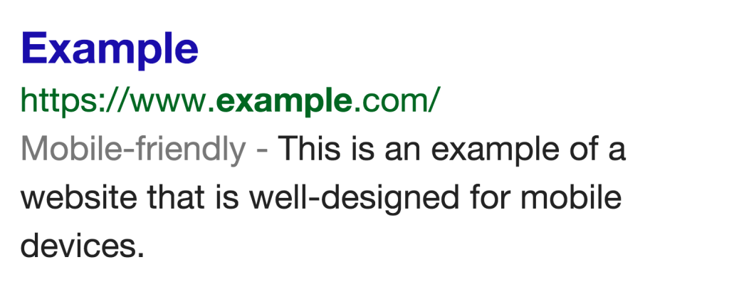
5) If your website is mobile-friendly then you will also notice a label saying “Mobile-friendly – ” when your site is searched on Google using a mobile device. It will be like this:
 What to Do if Your Website is Not Mobile-friendly?

If your website is not mobile-friendly then you must act now to make it responsive (mobile-friendly). Responsive website design means that your website will be automatically adjusted according the device size (desktop, mobile, tablets).
If you Have WordPress Website:
If you are using WordPress as a CMS, the you simply need to replace your current theme with a new responsive theme. I have selected few high rated and elegant responsive WordPress themes from themeforest.net:
Click Here to See All Mobile-Friendly and Responsive WordPress Themes
Just select a theme of your choice, upload it and make your website responsive (mobile-friendly).
If you have Static HTML Website:
If you have static HTML website, then find a HTML theme of your choice from following link:
Click Here to See Best Selling Responsive Static HTML Website Templates
Using a responsive WordPress theme is the easiest way to make your website mobile-friendly within minutes. Most of these themes are in the range of $20-$50 and are really elegant.